
Burning Man
The goal of this project was to build an engaging and impactful brand campaign that promotes a music festival. I decided to revamp the identity of Burning Man. It is an annual event in the desert that consists of artistic performances, art installations and music.

Make it stand out.
Branding a festival goes beyond creating a logo, a color palette and a collection of photography - it’s about creating a holistic identity built around more abstract and experiential concepts.


Keywords
Self-Expression
Community
Creativity
Culture
Dreamers
Desert
Fire
Logo Design Process

Self-Expression
The symbol represents self-expression, an essential concept for the festival as it emphasizes the unique gifts of the individual.

Physical Architecture
The layout of the temporary city depicts the modern-day take on the campfire circle. It urges to “circle the wagons” against the nearly boundless space.

The Sculpture
The name of the festival comes from its signature event – the symbolic ritual burning of a large wooden sculpture on the last day of the festival. The logo incorporates the facial shape of the Burning Man’s sculpture.


Burning Man.
Visual brand identity in the form of Social Media & Display Ads and Merchandise


Project Summary
This project showcases a comprehensive exploration of Burning Man’s brand campaign. Through my design process, I was able to execute the following:
A strong visual brand identity
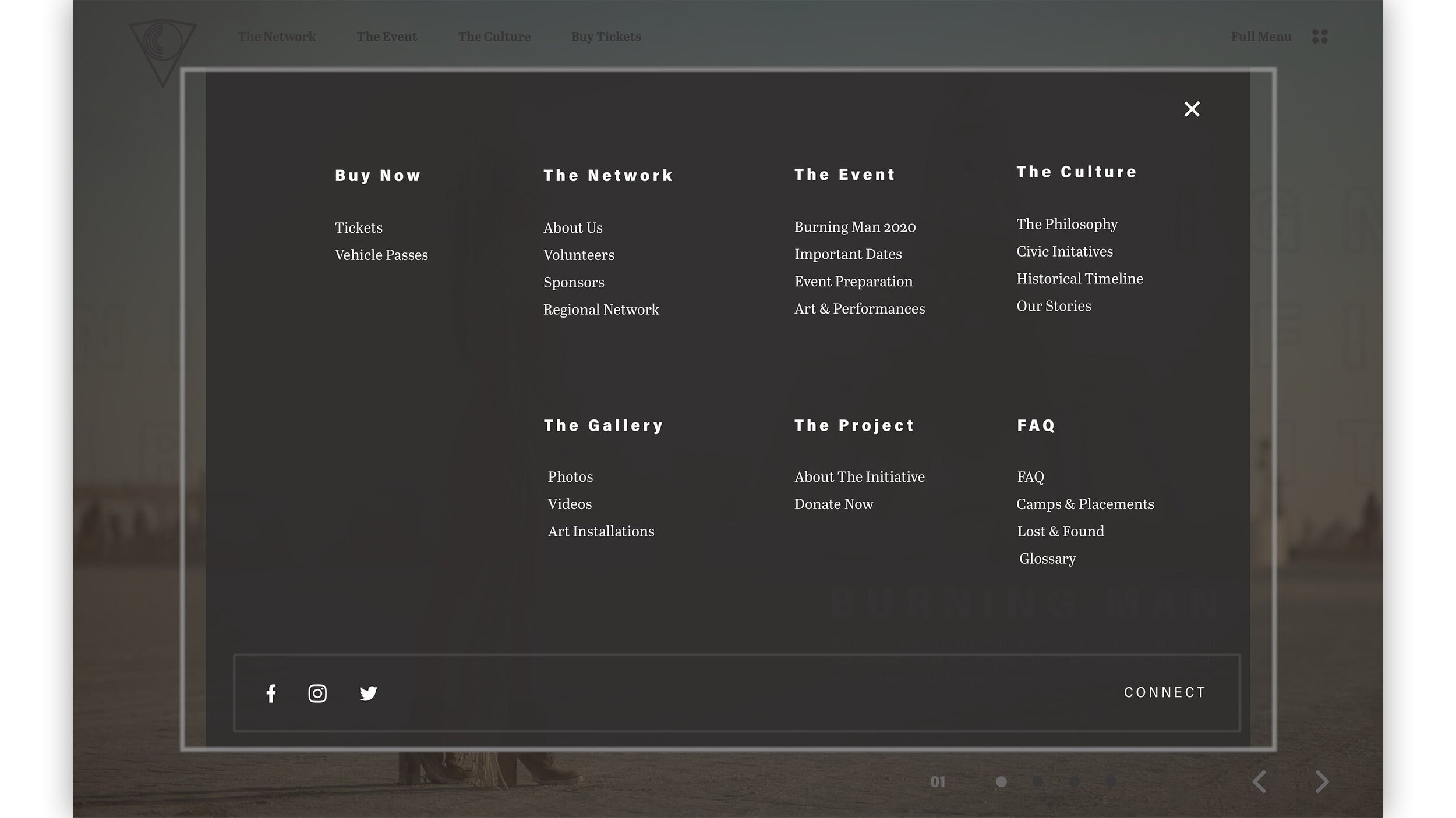
A responsive website that is a well-designed experience for the users and optimized to meet business goals
A logo for the campaign that captures the mood and tone of the campaign
A consistent visual identity that carries through different marketing and promotional materials
The development of a strong and creative design idea, while keeping user experience at the centre of the concept, has helped to drive the campaign of the festival.